Nike has the swish, McDonalds has its golden arches, the tube has the roundel – you get the picture. Logos are one of the most important parts of any organisation’s brand. Without one, it’s much harder for people to take you seriously and get recognition.
So a few months ago, with this (and our limited resources) in mind we put a call out on Twitter for a logo design for Books for London. And lo and behold the absolutely fantastic designer Luke Henley came to our rescue. We’ve been working with him to design a logo for Books for London, something that we think encapsulates what we want to do – lots of books moving around London’s tube and train networks for everyone to read:

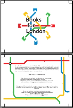
It’s going to go on our book swap signs, t-shirts, everywhere we can! Luke has also helped us out by designing an amazing flyer that we’re soon going to have printed – in the meantime, have a look (click to download a printable version of the flyer):
We really love our new logo and Luke too! So check out his portfolio, and be sure to follow him on Twitter.


Wow love the whole concept, And this should be a wide spread thing.
I mean it’s a brilliant idea who ever came up with it.
Posted by elsenor | September 16, 2012, 10:12 pmhttp://www.book-cycle.org – check them out!
Posted by scarlett | December 15, 2012, 9:23 pm